
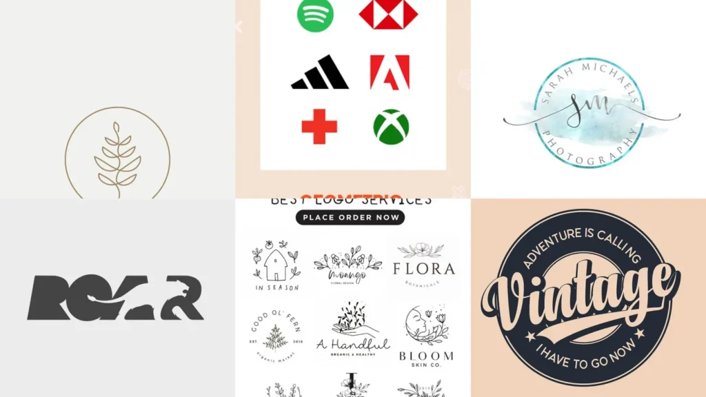

There’s a myth floating around that a good logo needs a fancy design degree or a huge budget. It doesn’t!
Some of the most memorable marks out there started as a quick sketch on a napkin, lol!
The truth is simple shapes and clear letters usually win. A logo just has to be recognizable, easy to reproduce and honest about what it represents.
This list pulls together seventeen directions that actually work in the real world, not just on a fancy portfolio site. Every idea here got checked for one thing.
Could a small business owner actually pull this off without hiring a whole branding agency?
Scrolling through way too many mood boards putting this together happened more than once! The ones that made the cut were the ones that still looked sharp shrunk down to a tiny app icon.
That’s because that’s where most logos actually live now.
Whether you’re starting a tailoring shop, redesigning a school crest or just love a good monogram, there’s something in here for you. Under each idea you’ll find the little details worth knowing plus a link to the full tutorial.
Ready to find your next favorite direction? Let’s get into it!
LOGO DESIGN IDEAS
Minimalist Line Art Logo

We’re starting off strong with minimalist line art. One continuous stroke does all the work here, no shading, no fuss!
This style photographs beautifully on business cards and website headers alike, haha! It even held up fine on a tiny takeout cup sticker.
- One line does it all
- Prints crisp at tiny sizes
- No color needed to work
Geometric Shape Logo Concept

Geometric shapes make a logo feel steady and trustworthy. Triangles, hexagons and circles layered together create depth without any extra clutter.
Recommending this approach to anyone building a tech brand keeps happening constantly. Something about clean shapes just reads modern instantly.
Even a single hexagon outline can carry a whole brand.
- Shapes build the whole mark
- Works in black and white too
- Scales up for signage easily
Watercolor Splash Logo Style

How pretty is this watercolor splash logo? The soft bleed of color gives it a handmade feel that a flat vector just can’t match.
Pointing clients here when they want a softer brand voice happens often. This one suits florists, cafes or anyone who doesn’t need sharp edges.
- Paint does the branding
- Looks great on packaging
- Each print comes out slightly different
Negative Space Animal Logo

Negative space tricks never get old, right? Hide a fox, a bird or a mountain inside the empty gaps of a bolder shape and people notice it twice.
That reveal alone is worth the extra design fee, lol! Little surprises like that keep people talking.
- Two images, one mark
- Sparks a double take every time
- Needs a bold outline to work
Hand Drawn Botanical Logo

Hand drawn botanical logos bring in leaves, vines and little florals for a natural feel. These suit skincare lines, plant shops or anything organic.
Sketching the shapes loosely first before tracing them clean always works best. A slightly imperfect line looks more genuine than a stiff one, every time!
- Grown, not manufactured
- Suits earthy color palettes
- Pairs nicely with a script font
Vintage Badge Logo Layout

Vintage badges never really went out of style, do they? A circular frame, bold banner text and a little star or two make anything look established.
If you were hunting for logo ideas design, this one is a keeper!
Reaching for this layout constantly for breweries, barbershops and coffee roasters happens for good reason. It just reads old and trusted, even on a brand new business.
A worn texture overlay makes it feel even more authentic, lol!
- Instant sense of history
- Great on stickers and stamps
- Reads well from far away
Modern Gradient Logo Palette

Modern gradients bring a soft glow to an otherwise simple mark. Two or three blended colors give flat shapes way more personality!
This palette keeps popping up in app icons and startup branding lately. It photographs nicely on phone screens too, which never hurts.
- Color does the heavy lifting
- Looks sharp on dark backgrounds
- No shadows required
Abstract Wave Logo Mark
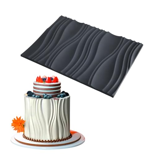
Abstract wave marks suggest motion without drawing anything literal. A few curved lines stacked together and suddenly it feels like water, wind or sound, haha!
Defaulting to this for wellness brands, music studios or travel companies happens a lot. Something about a wave just implies movement forward, no explanation needed.
- Movement without a single word
- Bends well into app icons
Monogram Initial Letter Design

Monograms are the classic answer to letter design ideas. Stacking two initials together always feels personal for weddings, boutiques and small home businesses. Who doesn’t love a good monogram?
Overlapping the letters slightly so they share one stroke always helps. Clients notice the difference immediately once the strokes connect.
- Two initials, one identity
- Embosses beautifully on paper
- Fits neatly on a ring or tag
Bold Serif Letter Logo

Bold serif letters carry weight instantly. A single oversized letter with thick strokes and small feet reads confident without saying a word.
Pitching this style constantly to law firms and publishers keeps working out. It just works when someone wants to feel established from day one.
A deep navy or black colorway makes it feel even more serious.
- One letter, full confidence
- Works great in all black
- Holds up on business cards
Trifold Brochure Layout Sample

Trifold brochures still get picked up at events, believe it or not! This sample layout keeps the front panel simple with one bold image.
It saves the details for the inside folds, covering solid leaflet design ideas for anyone new to print.
Leaving enough white space so the eye actually rests somewhere matters more than people think. A packed panel just gets skimmed and tossed, no matter how nice the photo is.
- Folds do the organizing
- Prints cheap at most copy shops
- Fits neatly in a mailer
Minimal Real Estate Leaflet

This minimal real estate leaflet keeps things clean. One large property photo, a short headline and just enough contact info to get someone calling, lol!
Reminding clients constantly that leaflets get glanced at for maybe three seconds never gets old. The rule is simple, big fonts, short copy, no exceptions!
- Three second first impression
- QR code fits in the corner nicely
- Doubles as a yard sign insert
Interlocking Double M Logo

Interlocking double M logos look tricky but they’re really just clever geometry. One M mirrors the other and they share a middle stroke.
If you were hunting for m these, this one is a keeper!
This is one of my favorite m these because it looks complex at a glance. It actually comes from a fairly simple grid underneath, which is fun explaining to people.
Not in my book does it need to be complicated to look impressive!
- One shape hiding two letters
- Works as a favicon too
- Looks sharp embossed on leather
Circular M Monogram Badge

A circular M monogram badge feels friendly and approachable compared to a sharp angular mark. The round frame softens even a bold letter inside it. How cute is this?
This one has been used for cafes, boutiques and once for a guy named Marcus who insisted on it. It just works for anyone whose brand happens to start with M.
- Round frames feel friendlier
- Stamps well on wax seals
- Reads clearly from a distance
Shield Emblem School Logo

Shield emblems are the go-to among school these for a reason. They read as established and proud, even for a school that opened last year.
If you were hunting for school these, this one is a keeper!
Layering a mascot, a motto banner and the founding year inside the shield always adds polish. It works on uniforms, letterhead and gym floors equally well!
- Instant sense of tradition
- Embroiders cleanly on uniforms
Owl Mascot School Logo

Who doesn’t love a good mascot, am I right? An owl reads smart and a little wise, which makes it a natural fit for any school crest.
Keep the owl simple with rounded wings so it still reads clearly. It needs to be stitched small on a jacket without losing shape.
Detailed feathers just turn into a blob at that size, haha!
- Wise bird, instant school pride
Needle Thread Tailor Emblem

Last but definitely not least, we have a needle and thread emblem for anyone chasing solid tailoring these. A simple needle with a looping thread trail says everything about the craft in one small image.
Same energy every single time! If you were hunting for tailoring these, this one is a keeper!
This mark looks great stitched directly onto garment tags, which is a nice little wink at the trade itself. It’s a small detail that customers actually notice. Same!
- The trade tells its own story
- Stitches beautifully onto tags
Just a little note - some of the links on here may be affiliate links, which means I might earn a small commission if you decide to shop through them (at no extra cost to you!). I only post content which I'm truly enthusiastic about and would suggest to others.
And as you know, I seriously love seeing your takes on the looks and ideas on here - that means the world to me! If you recreate something, please share it here in the comments or feel free to send me a pic. I'm always excited to meet y'all! ✨🤍
Xoxo Camille
Related stories
- 19+ Stunning Letter Cake Ideas That Steal the Show
- 19+ Stunning Sun Painting Ideas That Transform Any Room
- 18+ Bold Barber Tattoo Ideas That Turn Heads
- 19+ Stunning Paintings Ideas to Transform Any Wall
- 20+ Stunning Naked Cake Ideas That Steal the Show
- 18+ Stunning Vegetable Garden Aesthetic Ideas That Sell Out